Creating gradient shadows with Tailwind CSS and CSS
In this article, we'll delve into the art of crafting gradient shadows with both Tailwind CSS and Vanilla CSS. You might think of using box-shadow or text-shadow for this task, but unfortunately, these properties don't support gradients.
By using a combination of positioning, blurring, and gradient background, we can achieve the desired effect. Whether you're a Tailwind enthusiast or a purist who prefers Vanilla CSS, this guide has got you covered.
Example
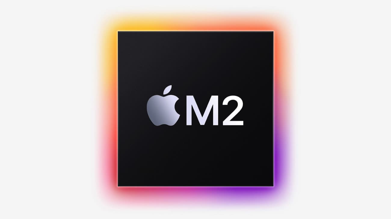
Here's a quick example of what we'll be building on a Card component:
Tailwind CSS
<div class="relative"> <div class="absolute -inset-2 rounded-lg bg-gradient-to-r from-yellow-600 via-orange-600 to-red-600 opacity-75 blur" ></div> <div class="relative flex h-64 w-64 items-center justify-center rounded-lg bg-slate-900 text-slate-300" > Gradient shadow </div></div>
To create a gradient shadow effect, we use two overlaid divs:
-
The first child div is positioned absolutely with respect to the parent div and extends slightly outside of it (
-inset-2). It has a rounded border (rounded-lg) and a linear gradient background that shifts from yellow to red (bg-gradient-to-r from-yellow-600 via-orange-600 to-red-600). It's also slightly transparent (opacity-80) and blurred (blur-lg) to create a diffused shadow effect. -
The second child div contains the actual content of the card. It's positioned relative to the parent div and has its content centered. It is styled with a dark gray background (
bg-slate-900) and lighter gray text (text-slate-300).
The key to this gradient shadow effect is the use of absolute positioning, gradient backgrounds, transparency, and blur on the first div.
Vanilla CSS
If you're not a fan of Tailwind CSS, you can achieve the same effect with vanilla CSS:
<div class="parent"> <div class="gradient-shadow"></div> <div class="content">Gradient shadow</div></div>
.parent { position: relative;}.gradient-shadow { position: absolute; top: -0.5rem; right: -0.5rem; bottom: -0.5rem; left: -0.5rem; background: linear-gradient(to right, #ca8a04, #ea580c, #dc2626); border-radius: 0.5rem; opacity: 0.8; filter: blur(20px);}.content { position: relative; display: flex; height: 16rem; width: 16rem; align-items: center; justify-content: center; border-radius: 0.5rem; background-color: #0f172a; color: #cbd5e1;}
Experimentation
You can use this techniques on any element button for example. You can also animated it to create a nice effect. For example with a pulse effect on the hover:
Considerations and alternatives
Our method for crafting gradient shadows using absolute positioning provides a seamless solution, but it does come with a limitation when transparency is required. If your design calls for a transparent background, the gradient shadow will become visible through the content, which may not align with your design intent.
In cases where a transparent background is a must, you might consider using the clip-path method as an alternative. As discussed in this article, clip-path can provide a solution for maintaining transparency while applying a gradient shadow.
Another technique is to use pseudo-elements, which can achieve a similar effect as absolute positioning. However, it's worth noting that this method also does not resolve the transparency issue.
Remember, in the world of design and development, there are often multiple approaches to a challenge. It's about understanding your specific needs and the nuances of each method to choose the best fit for your project.
Join my newsletter to stay updated about the latest things I've created and discover the great finds I've come across on the internet.